
In the name of Allah, most Gracious, most Compassionate..
Since this semester, I’m teaching DCM 1013 Graphical User Interface thus, this post will reflect on it. D stand for Diploma. And I have 102 diploma students. They are on their 2nd semester. Still young and passionate. They are so active during the class and despite how tired they are (Since my lecture is at 4pm-6pm and 8am – 10am), they still give their best through out the class. Expected some of them falling asleep during the class as well!
![]()
Cute voice?! Sometime I think they are bored with the lecture. But sometime I think they are too tired to absorb more knowledge especially during the evening class. And sometime I think they tried to give their best.
Let’s get back to the title.
Graphical User Interface. GUI. In between user and technology (Computer/Handphone/Standalone Platform), you can find User Interface. We use GUI to interact with the technology. To ease our daily routine. Either you realize or not, user interface have moving forward to the next generation. Some of them are portrayed in a movie like Iron Man and etc. And some of them already been developed and used in other countries. In Malaysia, we are developing. We are moving towards it.

User Interface Generation
Source : The Rakyat Post
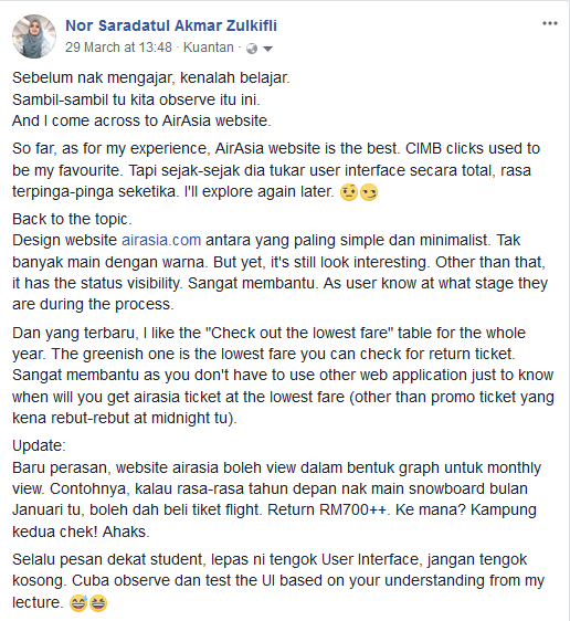
Before this, I used to update my point of view regarding AirAsia website on my facebook. Since I love to write, then I write a lot on my facebook! Used to write and share information on my personal blogspot, but since few years back, writing on blogspot getting harder! Even now! But, I’ll try to finish up this post till the end. InsyaALLAH.
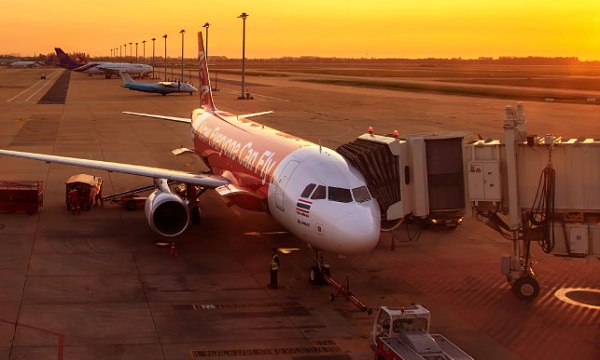
I’ve been using AirAsia website since few years back. I love looking at the price ticket. When it hit the lowest fare, I’ll purchase the ticket. Even though the destination only from Kuala Lumpur to Alor Setar, Kedah! =D To be honest, I preferred Malaysia Airlines hospitality. But, when it comes to EVERYONE CAN FLY WITH LOWEST FARE, AirAsia will be my choice. As for this time, I use AirAsia website as one of my example in my class other than Google and CIMB.
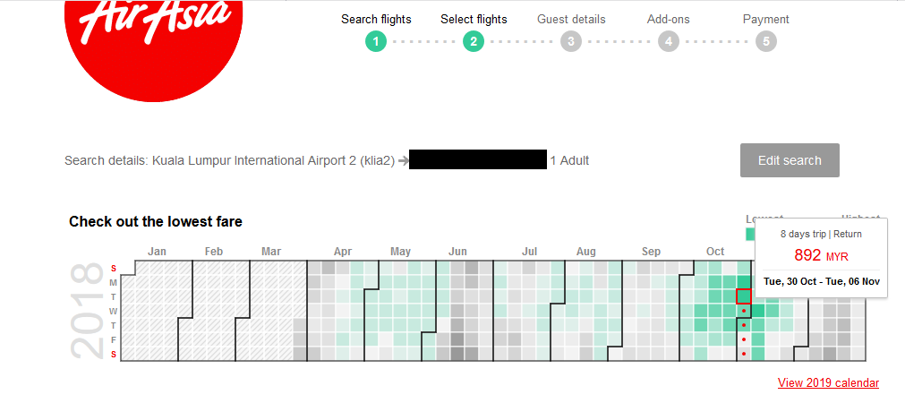
This post refer to this photo:
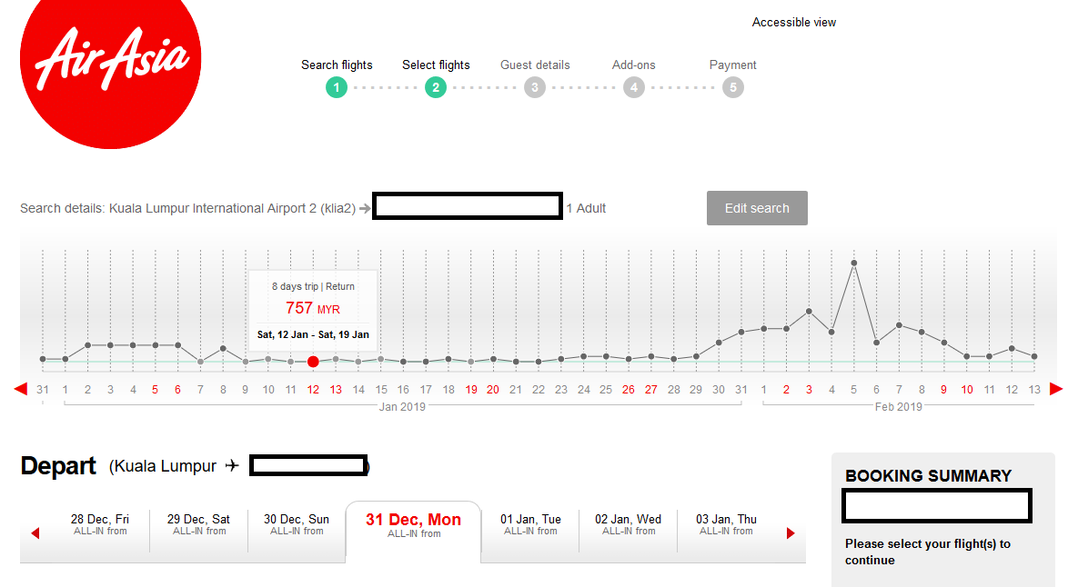
Lowest fare visualize in Graph
and this one:
Lowest Fare visualize in Timetable
And today, I found out that AirAsia Mobile Apps also offered the same thing. At first I didn’t notice about this because it’s been a while that I go through the apps until one of my student told me that he can’t opened the apps. For GUI project, students were asked to review User Interface from three different system which related to the interface prototype that they will develop at the end of the semester. They need to review the system based on the design elements used in the existing system and either the system following the Shneiderman’s Eight Golden Rules of Interface Design and the Usability Heuristic. Will share this later. InsyaALLAH.
I’ve tried to open the apps using my smartphone and unfortunately, the apps can’t be opened. When a friend ask me to update the apps, then I realized that my auto-update setting was set at certain hour. Once you update the apps, you can see that you can check the lowest fare using this apps as well. Now, it’s really EVERYONE CAN FLY.

Lowest Fare in Monthly View
By using the mobile apps, you can find the lowest fair at the date selection. Just choose the departure and destination, then select the date. You don’t have to find lowest fare using Skyscanner anymore. But, if you are not intending to fly with lowest fare, this apps is not for you.
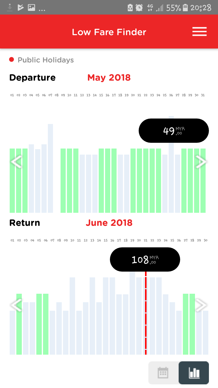
Lowest fare in Bar Graph View
As for overall, the design is simple and minimalist. I’m not talking about the Hospitality or the service provided. It’s yours to judge. I’m just reviewing the interface based on my point of view after conducting the class this semester. It’s not an easy task when your student keep asking for example. Instead of exploring some new website/mobile apps that unfamiliar, it’s better to stay with the one that you have been familiar with. Sound biased isn’t it? But as long as the interface design comply with the philosophy and design rules, why not?
In designing a good user interface, I keep telling my student to know who your users are. How your interface design can reduce the memory load of your user? And how the design can attract the user’s eyes when they go through the website or the apps. We, as a human interact with user interface using our visual. Thus, it is important to tackle the visual perception first.
Sometime, less is more. And because of this updating and new look of AirAsia Interface, buying flight ticket become easier! and in fact, dangerous to your bank account! Beware!
InsyaALLAH, I’ll try to share my student’s project on Interface Prototype next time. Hope they will developed something fresh and interesting GUI interface. Looking forward for the end product. Besides, other than AirAsia website and mobile apps, I prefer Google and CIMB. Both website and mobile apps. The interface design is getting better and better. They really comply with one of the Usability Heuristic, which is: Aesthetic and minimalist design
At first, I’m worried on how I can deliver this subject. But, after a few weeks, I found this subject are sooooo interesting and enjoyable! There is not right or wrong as long as you comply with the principle and rules and enjoy exploring everything in the cyberspace. Kreativiti adalah hak milik semua. Next time, we will learn how to turn the prototype into the real system. And that’s when the real excitement begins!
Love,
Dr. Sara
Leave a Reply